WPF 탭 컨트롤에서 사다리꼴 탭을 만드는 방법
WPF 탭 컨트롤에서 사다리꼴 탭을 만드는 방법
구글 크롬의 탭처럼 보이는 직사각형 탭이나 VS 2008의 코드 에디터의 탭과 같은 탭을 만들고 싶습니다.
WPF 스타일로 할 수 있습니까, 아니면 코드로 그려야 합니까?
인터넷에서 볼 수 있는 코드의 예가 있나요?
편집:
모서리를 둥글게 하거나 탭의 색상을 변경하는 방법은 많이 있습니다만, 다음과 같이 탭의 형상을 변경하는 예는 찾을 수 없습니다.
VS 2008 코드 에디터 탭
Google Chrome 탭
이 두 예제의 탭은 직사각형이 아니라 트롯입니다.
인터넷에서 이 문제에 대한 몇 가지 컨트롤 템플릿이나 해결책을 찾아보려고 했지만 "적절한" 해결책을 찾을 수 없었습니다.그래서 제 방식대로 작성했습니다.처음(그리고 마지막=)의 예를 다음에 나타냅니다.
<Window x:Class="TabControlTemplate.Window1"
xmlns="http://schemas.microsoft.com/winfx/2006/xaml/presentation"
xmlns:x="http://schemas.microsoft.com/winfx/2006/xaml"
xmlns:src="clr-namespace:TabControlTemplate"
Title="Window1" Width="600" Height="400">
<Window.Background>
<LinearGradientBrush StartPoint="0,0" EndPoint="1,1">
<GradientStop Color="#FF3164a5" Offset="1"/>
<GradientStop Color="#FF8AAED4" Offset="0"/>
</LinearGradientBrush>
</Window.Background>
<Window.Resources>
<src:ContentToPathConverter x:Key="content2PathConverter"/>
<src:ContentToMarginConverter x:Key="content2MarginConverter"/>
<SolidColorBrush x:Key="BorderBrush" Color="#FFFFFFFF"/>
<SolidColorBrush x:Key="HoverBrush" Color="#FFFF4500"/>
<LinearGradientBrush x:Key="TabControlBackgroundBrush" EndPoint="0.5,0" StartPoint="0.5,1">
<GradientStop Color="#FFa9cde7" Offset="0"/>
<GradientStop Color="#FFe7f4fc" Offset="0.3"/>
<GradientStop Color="#FFf2fafd" Offset="0.85"/>
<GradientStop Color="#FFe4f6fa" Offset="1"/>
</LinearGradientBrush>
<LinearGradientBrush x:Key="TabItemPathBrush" StartPoint="0,0" EndPoint="0,1">
<GradientStop Color="#FF3164a5" Offset="0"/>
<GradientStop Color="#FFe4f6fa" Offset="1"/>
</LinearGradientBrush>
<!-- TabControl style -->
<Style x:Key="TabControlStyle" TargetType="{x:Type TabControl}">
<Setter Property="BorderThickness" Value="1"/>
<Setter Property="Template">
<Setter.Value>
<ControlTemplate TargetType="TabControl">
<Grid>
<Grid.RowDefinitions>
<RowDefinition Height="Auto"/>
<RowDefinition Height="*"/>
</Grid.RowDefinitions>
<Border Grid.Row="1" BorderThickness="2,0,2,2" Panel.ZIndex="2" CornerRadius="0,0,2,2"
BorderBrush="{StaticResource BorderBrush}"
Background="{StaticResource TabControlBackgroundBrush}">
<ContentPresenter ContentSource="SelectedContent"/>
</Border>
<StackPanel Orientation="Horizontal" Grid.Row="0" Panel.ZIndex="1" IsItemsHost="true"/>
<Rectangle Grid.Row="0" Height="2" VerticalAlignment="Bottom"
Fill="{StaticResource BorderBrush}"/>
</Grid>
</ControlTemplate>
</Setter.Value>
</Setter>
</Style>
<!-- TabItem style -->
<Style x:Key="{x:Type TabItem}" TargetType="{x:Type TabItem}">
<Setter Property="SnapsToDevicePixels" Value="True"/>
<Setter Property="Template">
<Setter.Value>
<ControlTemplate TargetType="TabItem">
<Grid x:Name="grd">
<Path x:Name="TabPath" StrokeThickness="2"
Margin="{Binding ElementName=TabItemContent, Converter={StaticResource content2MarginConverter}}"
Stroke="{StaticResource BorderBrush}"
Fill="{StaticResource TabItemPathBrush}">
<Path.Data>
<PathGeometry>
<PathFigure IsClosed="False" StartPoint="1,0"
Segments="{Binding ElementName=TabItemContent, Converter={StaticResource content2PathConverter}}">
</PathFigure>
</PathGeometry>
</Path.Data>
<Path.LayoutTransform>
<ScaleTransform ScaleY="-1"/>
</Path.LayoutTransform>
</Path>
<Rectangle x:Name="TabItemTopBorder" Height="2" Visibility="Visible"
VerticalAlignment="Bottom" Fill="{StaticResource BorderBrush}"
Margin="{Binding ElementName=TabItemContent, Converter={StaticResource content2MarginConverter}}" />
<ContentPresenter x:Name="TabItemContent" ContentSource="Header"
Margin="10,2,10,2" VerticalAlignment="Center"
TextElement.Foreground="#FF000000"/>
</Grid>
<ControlTemplate.Triggers>
<Trigger Property="IsMouseOver" Value="True" SourceName="grd">
<Setter Property="Stroke" Value="{StaticResource HoverBrush}" TargetName="TabPath"/>
</Trigger>
<Trigger Property="Selector.IsSelected" Value="True">
<Setter Property="Fill" TargetName="TabPath">
<Setter.Value>
<SolidColorBrush Color="#FFe4f6fa"/>
</Setter.Value>
</Setter>
<Setter Property="BitmapEffect">
<Setter.Value>
<DropShadowBitmapEffect Direction="302" Opacity="0.4"
ShadowDepth="2" Softness="0.5"/>
</Setter.Value>
</Setter>
<Setter Property="Panel.ZIndex" Value="2"/>
<Setter Property="Visibility" Value="Hidden" TargetName="TabItemTopBorder"/>
</Trigger>
</ControlTemplate.Triggers>
</ControlTemplate>
</Setter.Value>
</Setter>
</Style>
</Window.Resources>
<Grid Margin="20">
<TabControl Grid.Row="0" Grid.Column="1" Margin="5" TabStripPlacement="Top"
Style="{StaticResource TabControlStyle}" FontSize="16">
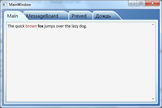
<TabItem Header="MainTab">
<Border Margin="10">
<TextBlock Text="The quick brown fox jumps over the lazy dog."/>
</Border>
</TabItem>
<TabItem Header="VeryVeryLongTab" />
<TabItem Header="Tab" />
</TabControl>
</Grid>
using System;
using System.Windows;
using System.Windows.Controls;
using System.Windows.Data;
using System.Windows.Media;

namespace TabControlTemplate
{
public partial class Window1
{
    public Window1()
    {
        InitializeComponent();
    }
}

public class ContentToMarginConverter: IValueConverter
{
    #region IValueConverter Members

    public object Convert(object value, Type targetType, object parameter, System.Globalization.CultureInfo culture)
    {
        return new Thickness(0, 0, -((ContentPresenter)value).ActualHeight, 0);
    }

    public object ConvertBack(object value, Type targetType, object parameter, System.Globalization.CultureInfo culture)
    {
        throw new NotImplementedException();
    }

    #endregion
}

public class ContentToPathConverter: IValueConverter
{
    #region IValueConverter Members

    public object Convert(object value, Type targetType, object parameter, System.Globalization.CultureInfo culture)
    {
        var ps = new PathSegmentCollection(4);
        ContentPresenter cp = (ContentPresenter)value;
        double h = cp.ActualHeight > 10 ? 1.4 * cp.ActualHeight : 10;
        double w = cp.ActualWidth > 10 ? 1.25 * cp.ActualWidth : 10;
        ps.Add(new LineSegment(new Point(1, 0.7 * h), true));
        ps.Add(new BezierSegment(new Point(1, 0.9 * h), new Point(0.1 * h, h), new Point(0.3 * h, h), true));
        ps.Add(new LineSegment(new Point(w, h), true));
        ps.Add(new BezierSegment(new Point(w + 0.6 * h, h), new Point(w + h, 0), new Point(w + h * 1.3, 0), true));
        return ps;
    }

    public object ConvertBack(object value, Type targetType, object parameter, System.Globalization.CultureInfo culture)
    {
        throw new NotImplementedException();
    }

    #endregion
}
}
탭 크기를 내용에 맞게 조정하기 위해 작성한 두 개의 변환기.사실 저는 콘텐츠 크기에 따라 Path 객체를 만듭니다.다양한 너비의 탭이 필요하지 않은 경우 다음과 같은 수정된 복사본을 사용할 수 있습니다.
<Style x:Key="tabPath" TargetType="{x:Type Path}">
      <Setter Property="Stroke" Value="Black"/>
      <Setter Property="Data">
          <Setter.Value>
              <PathGeometry Figures="M 0,0 L 0,14 C 0,18 2,20 6,20 L 60,20 C 70,20 80,0 84,0"/>
          </Setter.Value>
      </Setter>
  </Style>
화면:
참고: 이것은 루크의 훌륭한 답변의 부록에 불과합니다.
실행 시 Rooks의 솔루션이 완벽하게 동작하는 동안 VS2010 WPF 디자이너의 표면에서 Main Window를 열 때 문제가 있었습니다.디자이너가 예외를 무시하고 창을 표시하지 않았습니다.또한 TabControl.xaml의 TabItem용 ControlTemplate 전체에 파란색 스퀴글 행이 있어 툴팁에서 NullReferenceException이 발생했음을 알 수 있었습니다.관련 코드를 어플리케이션으로 이동했을 때도 같은 동작을 했습니다.두 대의 기계에서 문제가 발생했기 때문에 설치 문제와는 관련이 없다고 생각합니다.
누군가가 같은 문제를 겪고 있는 경우, 저는 이 예가 실행 시 및 디자이너에서도 작동하도록 수정했습니다.
첫 번째: TabControl-XAML 코드를 바꿉니다.
<Path x:Name="TabPath" StrokeThickness="2"
      Margin="{Binding ElementName=TabItemContent,
               Converter={StaticResource content2MarginConverter}}"
      Stroke="{StaticResource BorderBrush}"
      Fill="{StaticResource TabItemPathBrush}">
    <Path.Data>
        <PathGeometry>
            <PathFigure IsClosed="False" StartPoint="1,0"
                 Segments="{Binding ElementName=TabItemContent,
                            Converter={StaticResource content2PathConverter}}">
            </PathFigure>
        </PathGeometry>
    </Path.Data>
    <Path.LayoutTransform>
        <ScaleTransform ScaleY="-1"/>
    </Path.LayoutTransform>
</Path>
... by...
<Path x:Name="TabPath" StrokeThickness="2"
      Margin="{Binding ElementName=TabItemContent,
               Converter={StaticResource content2MarginConverter}}"
      Stroke="{StaticResource BorderBrush}"
      Fill="{StaticResource TabItemPathBrush}"
      Data="{Binding ElementName=TabItemContent,
             Converter={StaticResource content2PathConverter}}">
    <Path.LayoutTransform>
        <ScaleTransform ScaleY="-1"/>
    </Path.LayoutTransform>
</Path>
두 번째: ContentToPathConverter 클래스의 Convert 메서드 끝에 대체합니다.
return ps;
... by...
PathFigure figure = new PathFigure(new Point(1, 0), ps, false);
PathGeometry geometry = new PathGeometry();
geometry.Figures.Add(figure);

return geometry;
왜 이것이 디자이너에서 안정적으로 동작하는지는 설명하지 않지만, 루크의 원래 코드는 설명하지 않습니다.
방금 WPF용 Google Chrome과 같은 탭 컨트롤을 마쳤습니다.이 프로젝트에 대한 자세한 내용은 https://github.com/realistschuckle/wpfchrometabs 및 블로그 투고를 참조하십시오.
이를 통해 처음부터 사용자 정의 탭 컨트롤을 구축하는 방법을 더 잘 이해할 수 있기를 바랍니다.
<Grid>
    <Grid.Resources>
        <Style TargetType="{x:Type TabControl}">
            <Setter Property="ItemContainerStyle">
                <Setter.Value>
                    <Style>
                        <Setter Property="Control.Height" Value="20"></Setter>
                        <Setter Property="Control.Template">
                            <Setter.Value>
                                <ControlTemplate TargetType="{x:Type TabItem}">
                                    <Grid Margin="0 0 -10 0">
                                        <Grid.ColumnDefinitions>
                                            <ColumnDefinition Width="10">
                                            </ColumnDefinition>
                                            <ColumnDefinition></ColumnDefinition>
                                            <ColumnDefinition Width="10"></ColumnDefinition>
                                        </Grid.ColumnDefinitions>
                                        <Path Data="M10 0 L 0 20 L 10 20 " Fill="{TemplateBinding Background}" Stroke="Black"></Path>
                                        <Rectangle Fill="{TemplateBinding Background}" Grid.Column="1"></Rectangle>
                                        <Rectangle VerticalAlignment="Top" Height="1" Fill="Black" Grid.Column="1"></Rectangle>
                                        <Rectangle VerticalAlignment="Bottom" Height="1" Fill="Black" Grid.Column="1"></Rectangle>
                                        <ContentPresenter Grid.Column="1" ContentSource="Header" />
                                       <Path Data="M0 20 L 10 20 L0 0" Fill="{TemplateBinding Background}" Grid.Column="2" Stroke="Black"></Path>
                                    </Grid>
                                    <ControlTemplate.Triggers>
                                        <Trigger Property="IsSelected" Value="True">
                                            <Trigger.Setters>
                                                <Setter Property="Background" Value="Beige"></Setter>
                                                <Setter Property="Panel.ZIndex" Value="1"></Setter>
                                            </Trigger.Setters>
                                        </Trigger>
                                        <Trigger Property="IsSelected" Value="False">
                                            <Trigger.Setters>
                                                <Setter Property="Background" Value="LightGray"></Setter>
                                            </Trigger.Setters>
                                        </Trigger>
                                    </ControlTemplate.Triggers>
                                </ControlTemplate>
                            </Setter.Value>
                        </Setter>
                    </Style>
                </Setter.Value>
            </Setter>
        </Style>
    </Grid.Resources>
    <TabControl>
        <TabItem Header="One" ></TabItem>
        <TabItem Header="Two" ></TabItem>
        <TabItem Header="Three" ></TabItem>
    </TabControl>
</Grid>
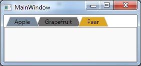
오래된 건 알지만 제안하고 싶은 건
XAML:
    <Window.Resources>

    <ControlTemplate x:Key="trapezoidTab" TargetType="TabItem">
        <Grid>
            <Polygon Name="Polygon_Part" Points="{Binding TabPolygonPoints}" />
            <ContentPresenter Name="TabContent_Part" Margin="{TemplateBinding Margin}" Panel.ZIndex="100" ContentSource="Header" HorizontalAlignment="Center" VerticalAlignment="Center"/>
        </Grid>

        <ControlTemplate.Triggers>

            <Trigger Property="IsMouseOver" Value="False">
                <Setter TargetName="Polygon_Part" Property="Stroke" Value="LightGray"/>
                <Setter TargetName="Polygon_Part" Property="Fill" Value="DimGray" />
            </Trigger>

            <Trigger Property="IsMouseOver" Value="True">
                <Setter TargetName="Polygon_Part" Property="Fill" Value="Goldenrod" />
                <Setter TargetName="Polygon_Part" Property="Stroke" Value="LightGray"/>
            </Trigger>

            <Trigger Property="IsSelected" Value="False">
                <Setter Property="Panel.ZIndex" Value="90"/>
            </Trigger>

            <Trigger Property="IsSelected" Value="True">
                <Setter Property="Panel.ZIndex" Value="100"/>
                <Setter TargetName="Polygon_Part" Property="Stroke" Value="LightGray"/>
                <Setter TargetName="Polygon_Part" Property="Fill" Value="LightSlateGray "/>
            </Trigger>


        </ControlTemplate.Triggers>

    </ControlTemplate>

</Window.Resources>

<!-- Test the tabs-->
<TabControl Name="FruitTab">
    <TabItem Header="Apple" Template="{StaticResource trapezoidTab}" />
    <TabItem Margin="-8,0,0,0" Header="Grapefruit" Template="{StaticResource trapezoidTab}" />
    <TabItem Margin="-16,0,0,0" Header="Pear" Template="{StaticResource trapezoidTab}"/>
</TabControl>
뷰 모델:
    using System;
    using System.Collections.Generic;
    using System.Linq;
    using System.Text;
    using System.Threading.Tasks;
    using System.Windows;
    using System.Windows.Shapes;
    using System.ComponentModel;
    using System.Globalization;
    using System.Windows.Media;

    namespace TrapezoidTab
    {
        public class TabHeaderViewModel : INotifyPropertyChanged
        {
            public event PropertyChangedEventHandler PropertyChanged;
            private string _tabHeaderText;
            private List<Point> _polygonPoints;
            private PointCollection _pointCollection;

            public TabHeaderViewModel(string tabHeaderText)
            {
                _tabHeaderText = tabHeaderText;
                TabPolygonPoints = GenPolygon();
            }

            public PointCollection TabPolygonPoints
            {
                get { return _pointCollection; }
                set
                {
                    _pointCollection = value;
                    if (PropertyChanged != null)
                        PropertyChanged(this, new PropertyChangedEventArgs("TabPolygonPoints"));
                }
            }

            public string TabHeaderText
            {
                get { return _tabHeaderText; }
                set
                {
                    _tabHeaderText = value;
                    TabPolygonPoints = GenPolygon();
                    if (PropertyChanged != null)
                        PropertyChanged(this, new PropertyChangedEventArgs("TabHeaderText"));
                }
            }

            private PointCollection GenPolygon()
            {
                var w = new FormattedText(_tabHeaderText, CultureInfo.GetCultureInfo("en-us"), FlowDirection.LeftToRight, new Typeface("Tahoma"), 12, Brushes.Black);
                var width = w.Width + 30;

                _polygonPoints = new List<Point>(4);
                _pointCollection = new PointCollection(4);

                _polygonPoints.Add(new Point(2, 21));
                _polygonPoints.Add(new Point(10, 2));
                _polygonPoints.Add(new Point(width, 2));
                _polygonPoints.Add(new Point(width + 8, 21));

                foreach (var point in _polygonPoints)
                    _pointCollection.Add(point);

                return _pointCollection;
            }
        }
    }
메인:
namespace TrapezoidTab
{
    /// <summary>
    /// Interaction logic for MainWindow.xaml
    /// </summary>
    public partial class MainWindow : Window
    {
        public MainWindow()
        {
            InitializeComponent();

            foreach (var obj in FruitTab.Items)
            {
                var tab = obj as TabItem;
                if (tab == null) continue;
                tab.DataContext = new TabHeaderViewModel(tab.Header.ToString());
            }
        }
    }
}
네, 그렇게 할 수 있어요. 하지만 당신이 해야 할 일은 맞춤 제어 장치를 만들 수 있어요http://www.switchonthecode.com/tutorials/the-wpf-tab-control-inside-and-out (데드링크)를 확인해 주세요. Wayback Machine은 튜토리얼을 위해 여기를 리디렉션합니다."wpf" "tabcontrol" "shape"를 검색하기만 하면 결과 페이지가 나타납니다.
직접 사용해 본 적은 없지만 템플릿의 태그를 태그로 대체하여 원하는 모양을 얻을 수 있습니다.
왼쪽과 오른쪽 탭 모서리를 모두 기울이기 위해, 여기 Slauma가 루크의 수락된 답변을 개선한 내용이 있습니다.이것은 ContentToPathConverter 클래스의 Convert 메서드를 대체하는 것입니다.
    public object Convert(object value, Type targetType, object parameter, System.Globalization.CultureInfo culture)
    {
        var ps = new PathSegmentCollection(4);
        ContentPresenter cp = (ContentPresenter)value;
        double h = cp.ActualHeight > 10 ? 1.4 * cp.ActualHeight : 10;
        double w = cp.ActualWidth > 10 ? 1.25 * cp.ActualWidth : 10;
        // Smaller unit, so don't need fractional multipliers.
        double u = 0.1 * h;
        // HACK: Start before "normal" start of tab.
        double x0 = -4 * u;
        // end of transition
        double x9 = w + 8 * u;
        // transition width
        double tw = 8 * u;
        // top "radius" (actually, gradualness of curve. Larger value is more rounded.)
        double rt = 5 * u;
        // bottom "radius" (actually, gradualness of curve. Larger value is more rounded.)
        double rb = 3 * u;
        // "(x0, 0)" is start point - defined in PathFigure.
        // Cubic: From previous endpoint, 2 control points + new endpoint.
        ps.Add(new BezierSegment(new Point(x0 + rb, 0), new Point(x0 + tw - rt, h), new Point(x0 + tw, h), true));
        ps.Add(new LineSegment(new Point(x9 - tw, h), true));
        ps.Add(new BezierSegment(new Point(x9 - tw + rt, h), new Point(x9 - rb, 0), new Point(x9, 0), true));

        // "(x0, 0)" is start point.
        PathFigure figure = new PathFigure(new Point(x0, 0), ps, false);
        PathGeometry geometry = new PathGeometry();
        geometry.Figures.Add(figure);

        return geometry;
    }
여백)을되는 것은 "TabControl" ControlTemplate"입니다).Margin="20,0,20,0"
<Style x:Key="TabControlStyle" TargetType="{x:Type TabControl}">
    ...
    <Setter Property="Template">
        ...
        <StackPanel Grid.Row="0" Panel.ZIndex="1" Orientation="Horizontal" IsItemsHost="true" Margin="20,0,20,0"/>
문제: 선택한 탭이 아닌 탭의 왼쪽 끝에 약간의 시각적 "글리치"가 있습니다.탭 영역 시작 전에 시작하는 것은 "뒤로 가기"와 관련이 있다고 생각합니다.또는 탭의 맨 아래에 있는 선 그리기(탭의 "일반" 직사각형의 왼쪽 가장자리보다 먼저 시작하는지 알 수 없음)와 관련이 있을 수도 있습니다.
언급URL : https://stackoverflow.com/questions/561931/how-to-create-trapezoid-tabs-in-wpf-tab-control
'programing' 카테고리의 다른 글
| 여러 커밋을 선택하는 방법 (0) | 2023.04.10 |
|---|---|
| 목록의 모든 문자열을 정수로 변환 (0) | 2023.04.10 |
| T-SQL에서 Date Time 필드를 업데이트하려면 어떻게 해야 합니까? (0) | 2023.04.10 |
| 'git reset --hard HEAD'를 사용하여 이전 커밋으로 되돌리려면 어떻게 해야 합니까? (0) | 2023.04.10 |
| WPF에서의 하이퍼링크 사용 예시 (0) | 2023.04.10 |